

verifyAI
VerifyAI is an innovative company dedicated to transforming the employee verification process through advanced AI technologies.
Recently, VerifyAI acquired wtVision, an employee rewards company, recognizing the strength of their backend powered by low-cost APIs. However, the UI of their dashboard was lacking in user experience, prompting VerifyAI to revamp the front-end design while retaining the existing backend.
I was tasked with leading the design system development for this new dashboard.
slack
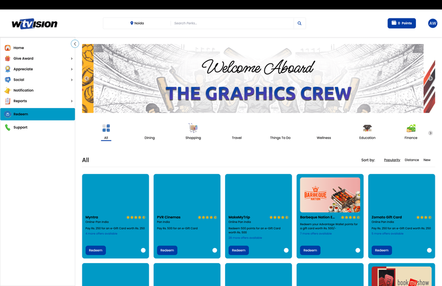
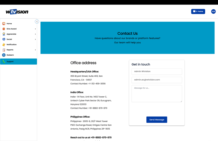
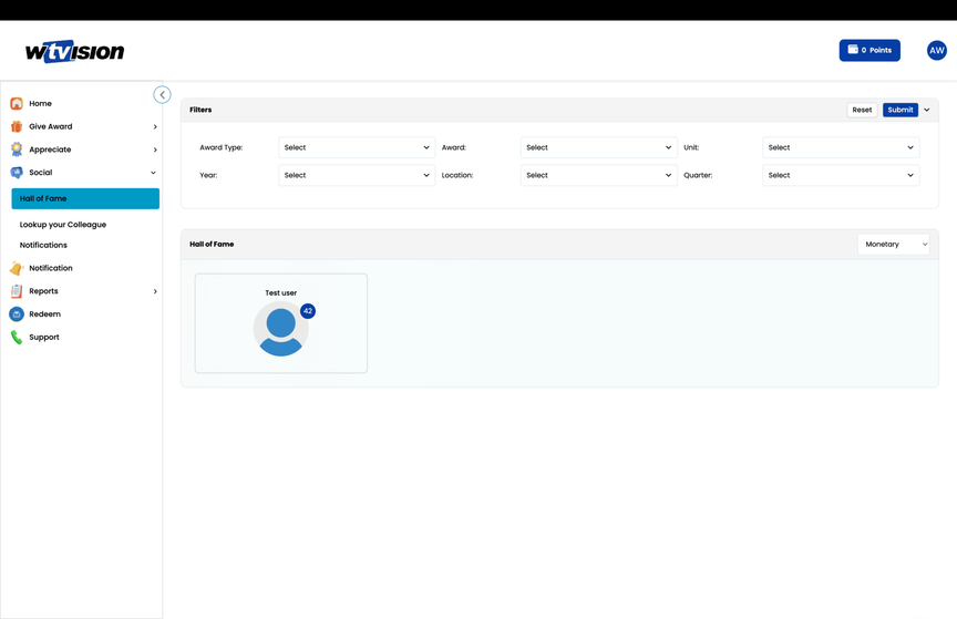
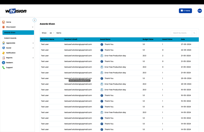
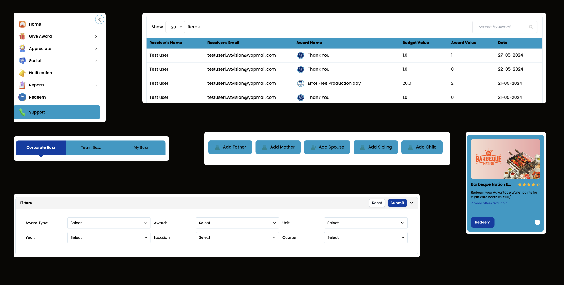
wtVision dashboard screenshots
objectives
At VerifyAI, my goal was to address the UI challenges of the newly acquired platform.
Previously, every new project or phase required starting from scratch, leading to the repetitive design of components.
To resolve these issues, we needed to:
- Recreate Existing Components
- Document Use Cases
research and discovery
The research phase was crucial to inform the design decisions, my goals were to understand the users’ needs and pain points and identify key areas where the current design was falling short.

Stakeholder Interviews
I conducted interviews with key stakeholders at VerifyAI to gain insights into business goals, user needs, and technical constraints.

User Research
I conducted user research with HR professionals and new employees to understand key pain points and areas for improvement in the verification process.
key findings
The key takeaways from our research were:
- Manual Errors: Repeated issues with manual data entry caused delays and inaccuracies.
- Time Consumption: Verification processes were tedious and time-intensive.
- User Needs: Both HR professionals and employees desired a system that was fast, accurate, and intuitive.
design process
As a Design System Lead, I had to make strategic decisions to develop a scalable design system. Here’s how I approached it:
- Scalability: Built a system adaptable to evolving use cases, expanding the component library as needed.
- User-Centric Design: Integrated user research insights to shape components and interaction patterns.
- Real-Data Implementation: Used real data during design to preempt issues like text overflow and missing elements.
laying the foundations
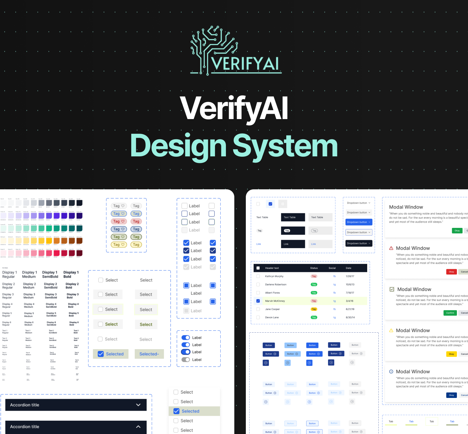
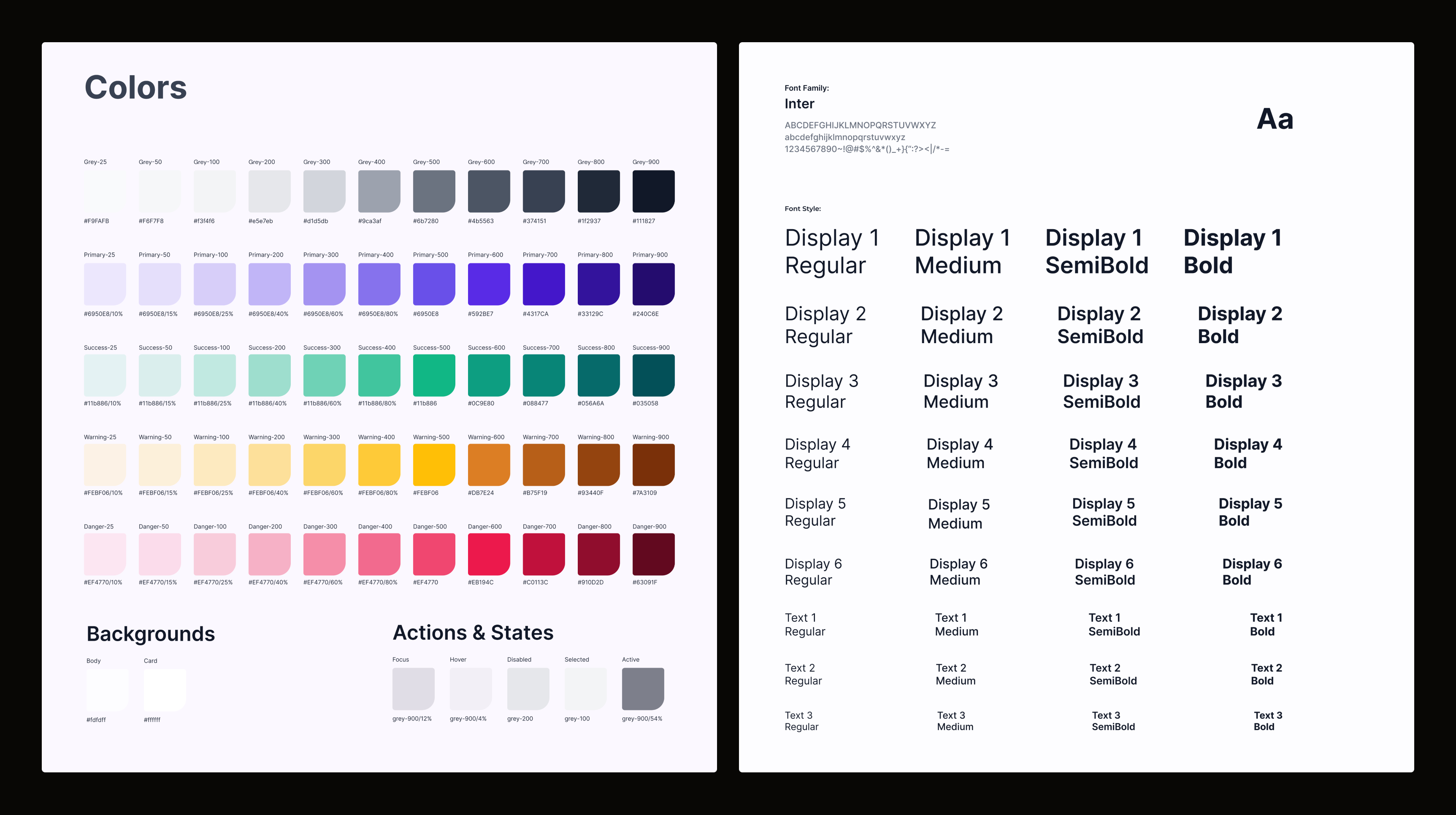
Typography and Color Palette: We selected typography and a color palette that balanced modernity with user-friendly emotional sensitivity.
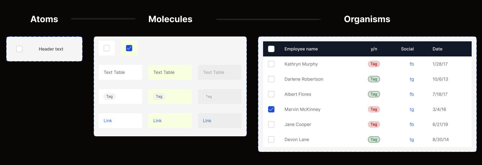
Next, we developed components using the Atomic Design approach, ensuring alignment with developers through shared naming conventions and mirroring the design system in Storybook for a streamlined process.
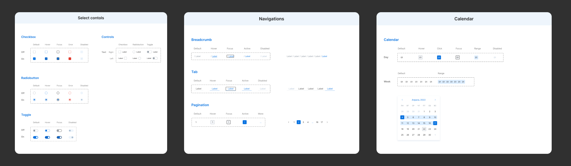
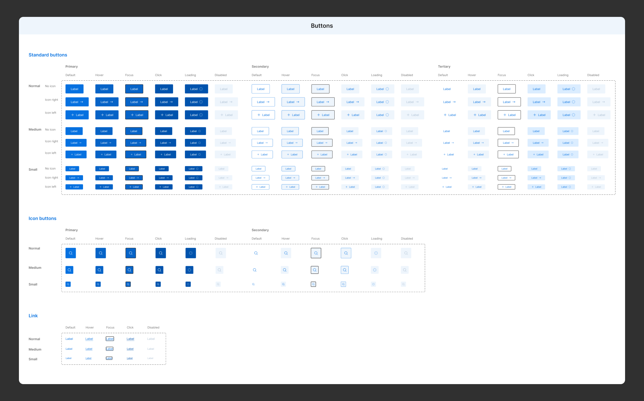
component library
Component name
A specific and unique UI component name, to avoid miscommunication between designers and developers. This needed to be clear so that the components would work as they were supposed to without error.
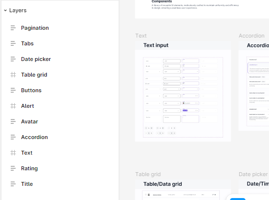
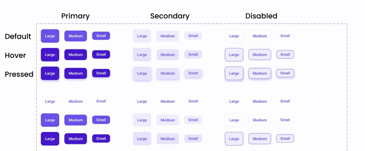
State changes
Recommended defaults and the subsequent changes in appearance.
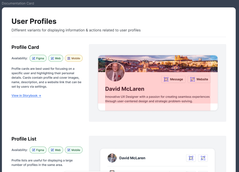
Usage examples
Sample implementations and visual examples demonstrating how the component should be used in various contexts.
accessibility integration
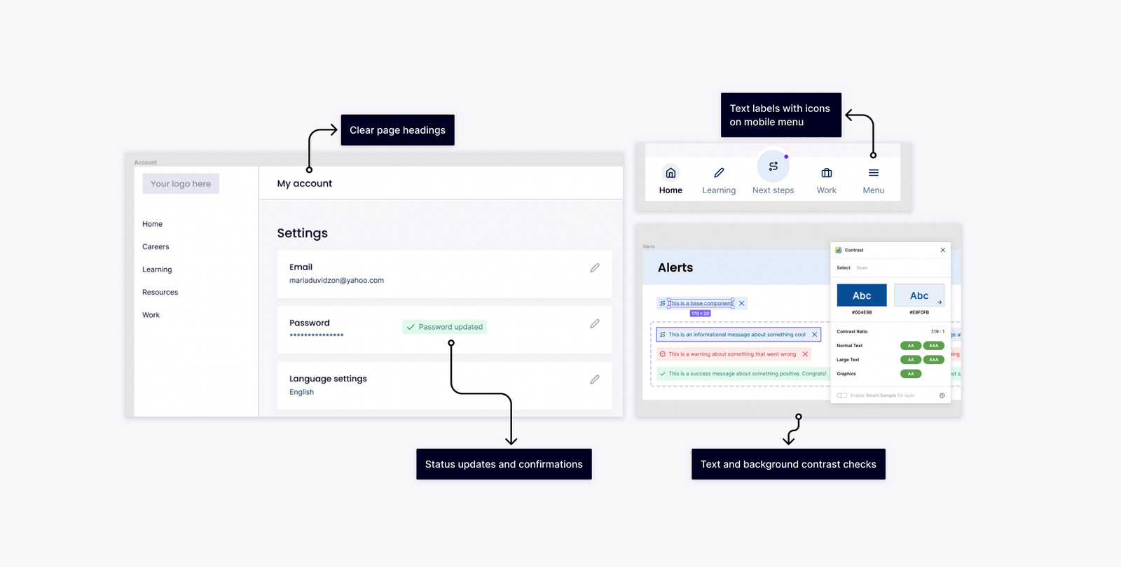
From the start, we aimed for WCAG 2.1 AA compliance to ensure broader accessibility while balancing design flexibility.
Key focus areas:
- Color Contrast: Ensured readability across backgrounds and interaction states, adhering to standards for disabled buttons.
- Font Size & Touch Targets: Verified optimal sizes for mobile devices to enhance usability.
- Text Labels with Icons: Included text labels in mobile navigation to improve clarity.
- Consistency: Maintained uniform layouts and UI elements for a cohesive experience.


what would i do different?
- We focused on consistency and scalability but would incorporate regular feedback loops to refine designs in real time.
- We documented basic components and guidelines but would enhance documentation with detailed explanations and diverse use cases.
- We worked sequentially across teams but would engage cross-functional teams earlier to streamline processes.


