
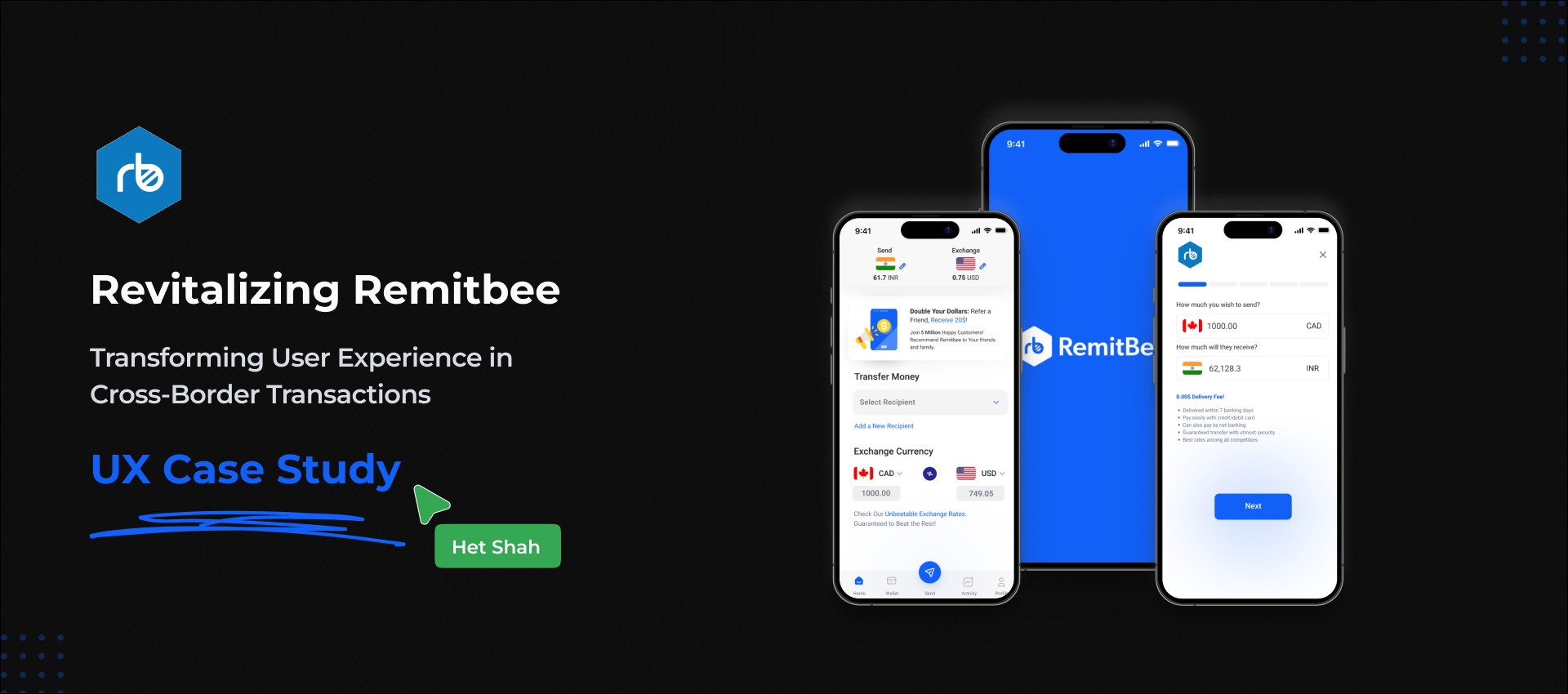

remitbee
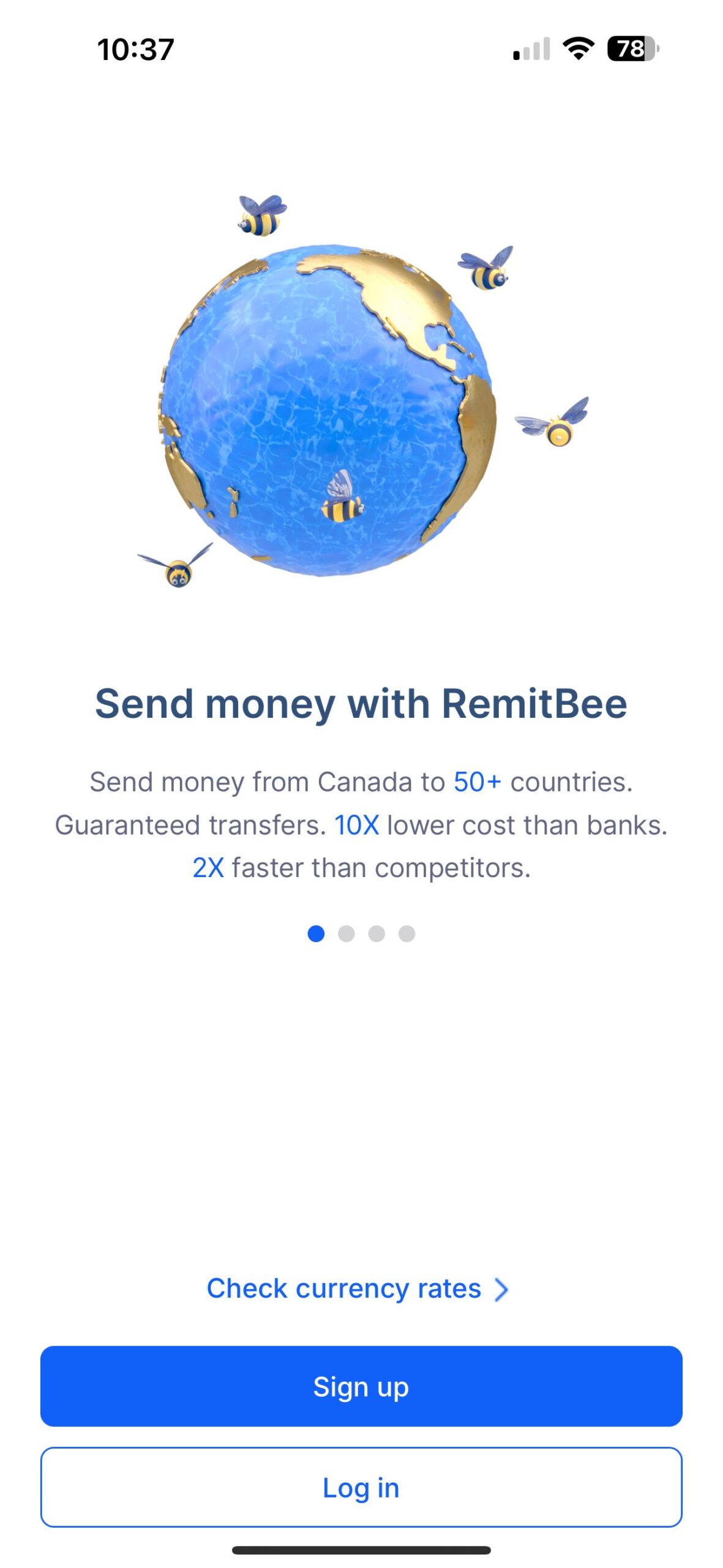
/transforming user experience in cross border transactionsRemitbee, a leading cross-border money transfer app, needed a redesign to address its complex user flow and improve overall usability.
The app’s recipient addition process was confusing, and its navigation lacked clarity, leading to user frustration.
By simplifying recipient addition, enhancing navigation, and creating a more engaging onboarding experience, I aimed to deliver a smoother, more secure, and user-friendly platform.
zoom
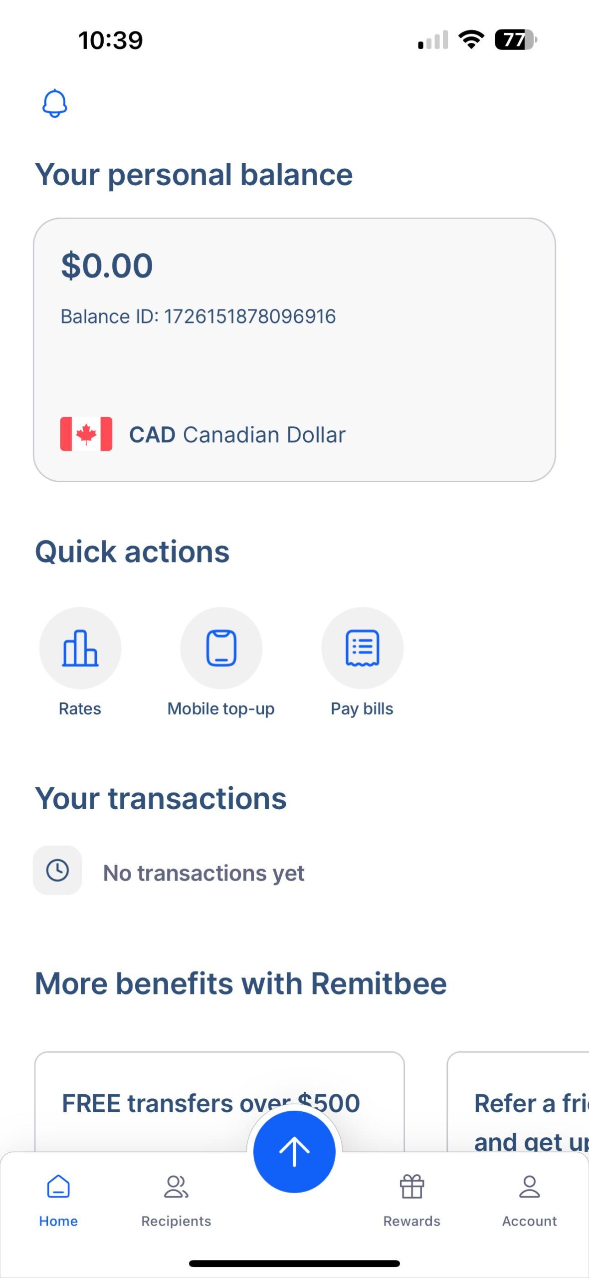
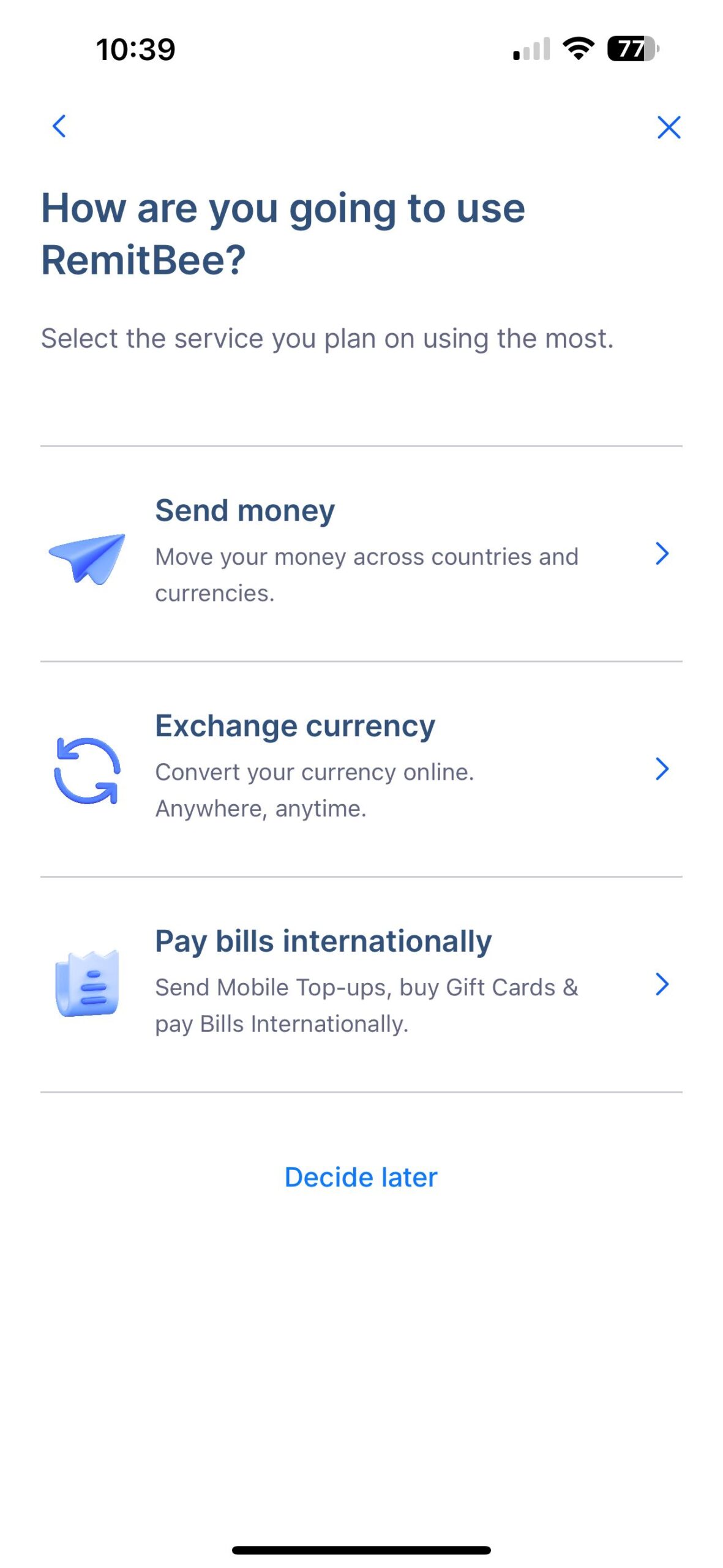
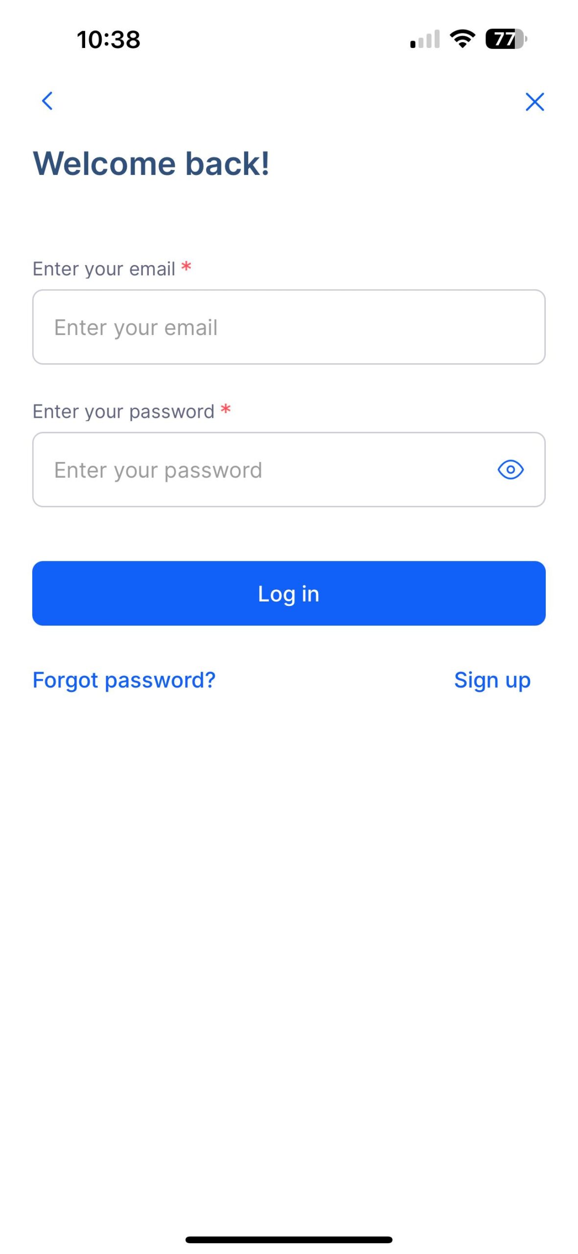
existing remitbee app screenshots
research phase
The research phase focused on identifying the key pain points in the Remitbee app. The primary research goals were:
- Understand user frustrations with the recipient addition process.
- Evaluate the app’s navigation and discoverability of key features.
- Assess the effectiveness of the current onboarding experience.
- Gather insights on security concerns and user trust in the app.
To achieve these goals, I conducted user interviews, surveys, and usability testing with both new and existing users of the Remitbee app.
The research involved direct interactions with users who regularly send money abroad, such as international students, and professionals supporting their families back home.
-

- user surveys via typeform
-

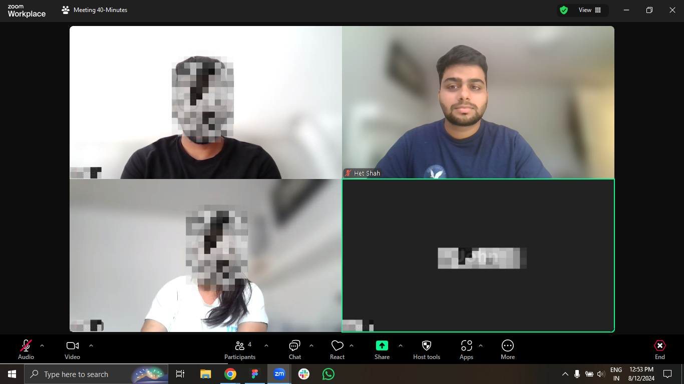
- user interviews via zoom
-

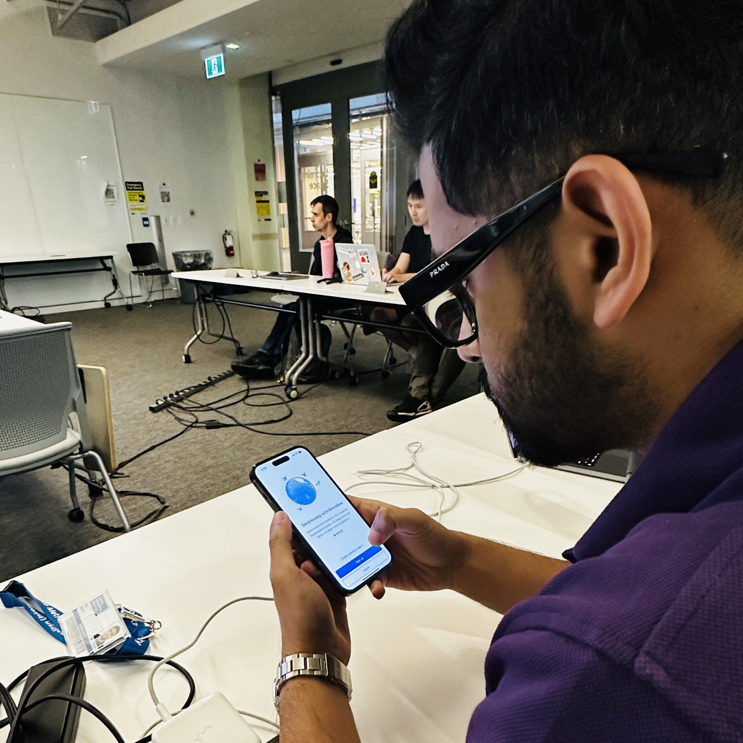
- usability testing session
audience
gender: mixed
age: 24 - 38
gender: mixed
age: 21 - 38
gender: mixed
age: 24 - 26
discovery phase
key insights we got from the research phase were:
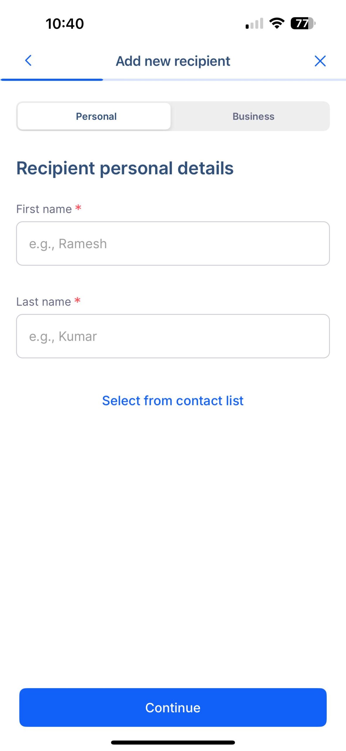
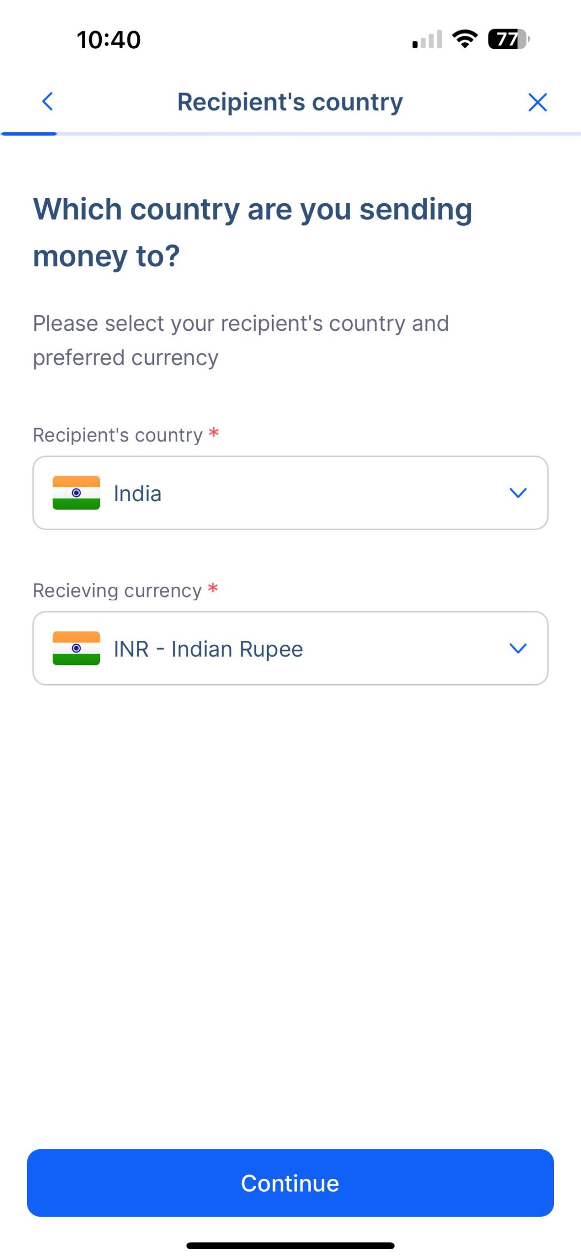
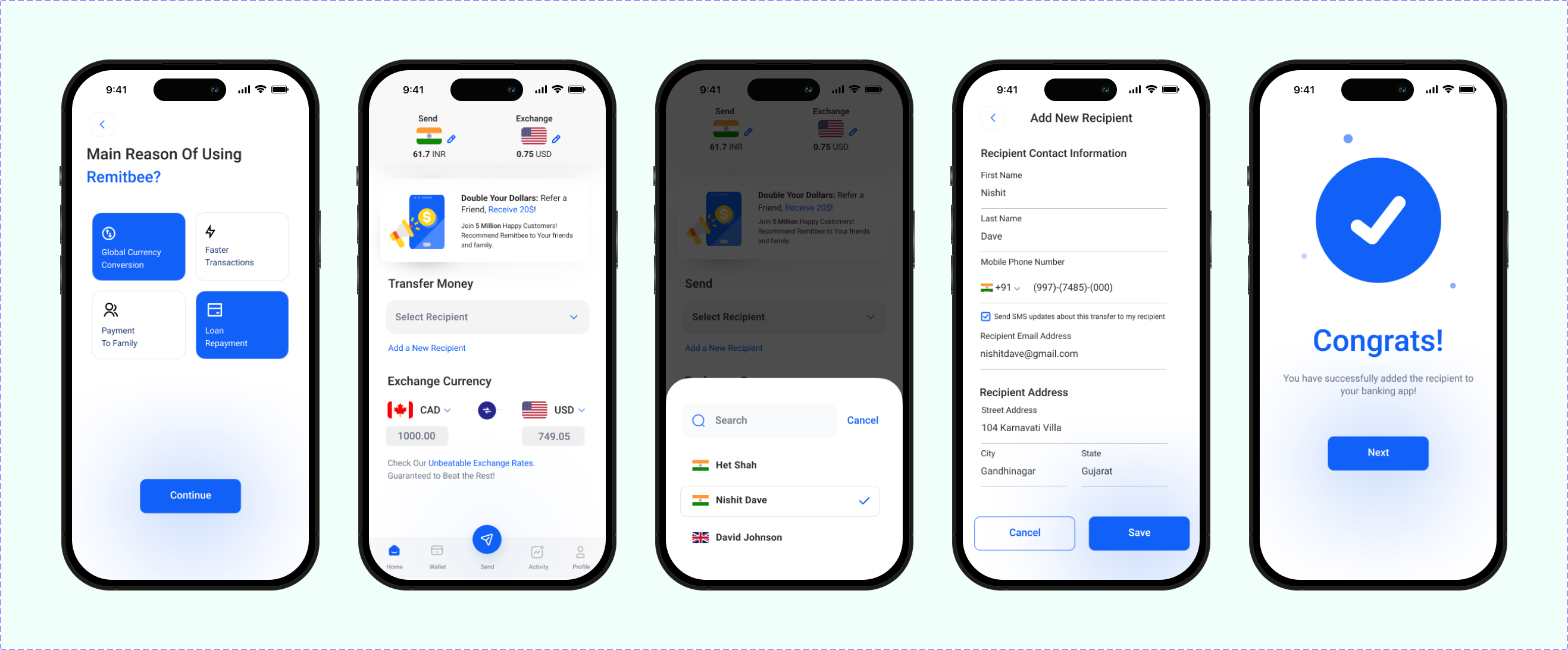
- The multi-step process for adding new recipients was confusing and overwhelming.
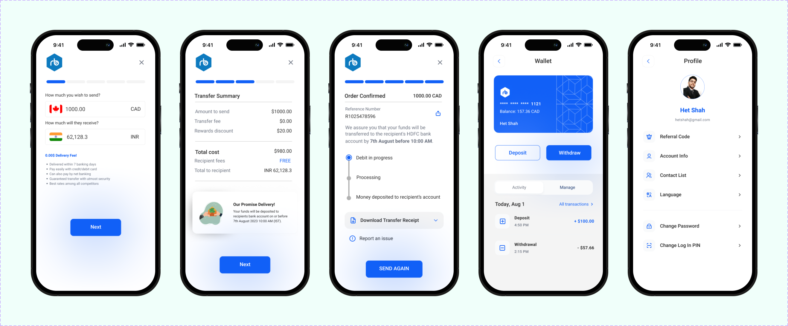
- The menu structure was unclear and difficult for users to navigate.
- The onboarding process was ineffective at capturing user interest and did not clearly explain the app’s benefits.
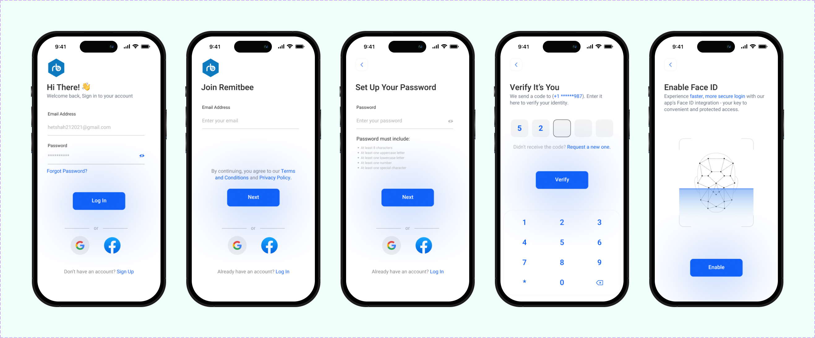
- Users expressed a need for enhanced security features, such as Face ID and OTP verification.
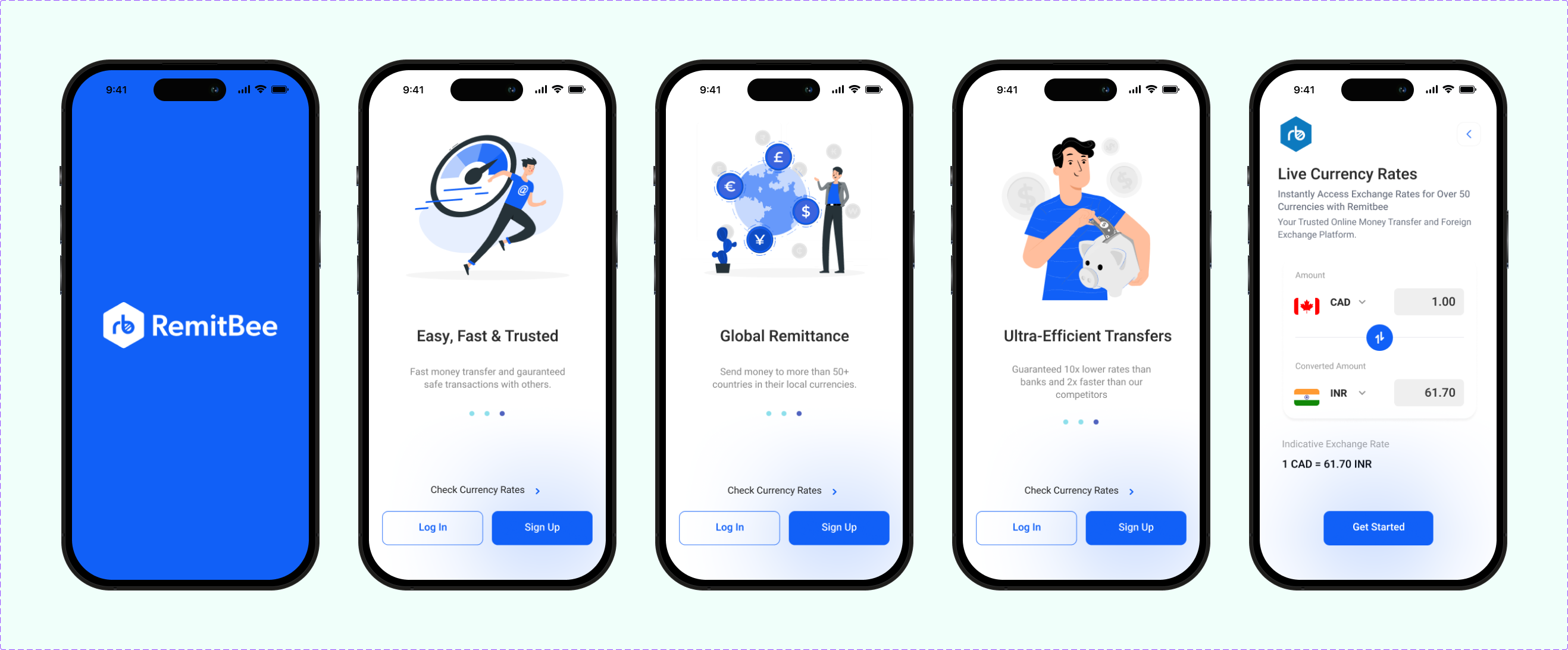
- Users required visible currency rates before login to make informed decisions.
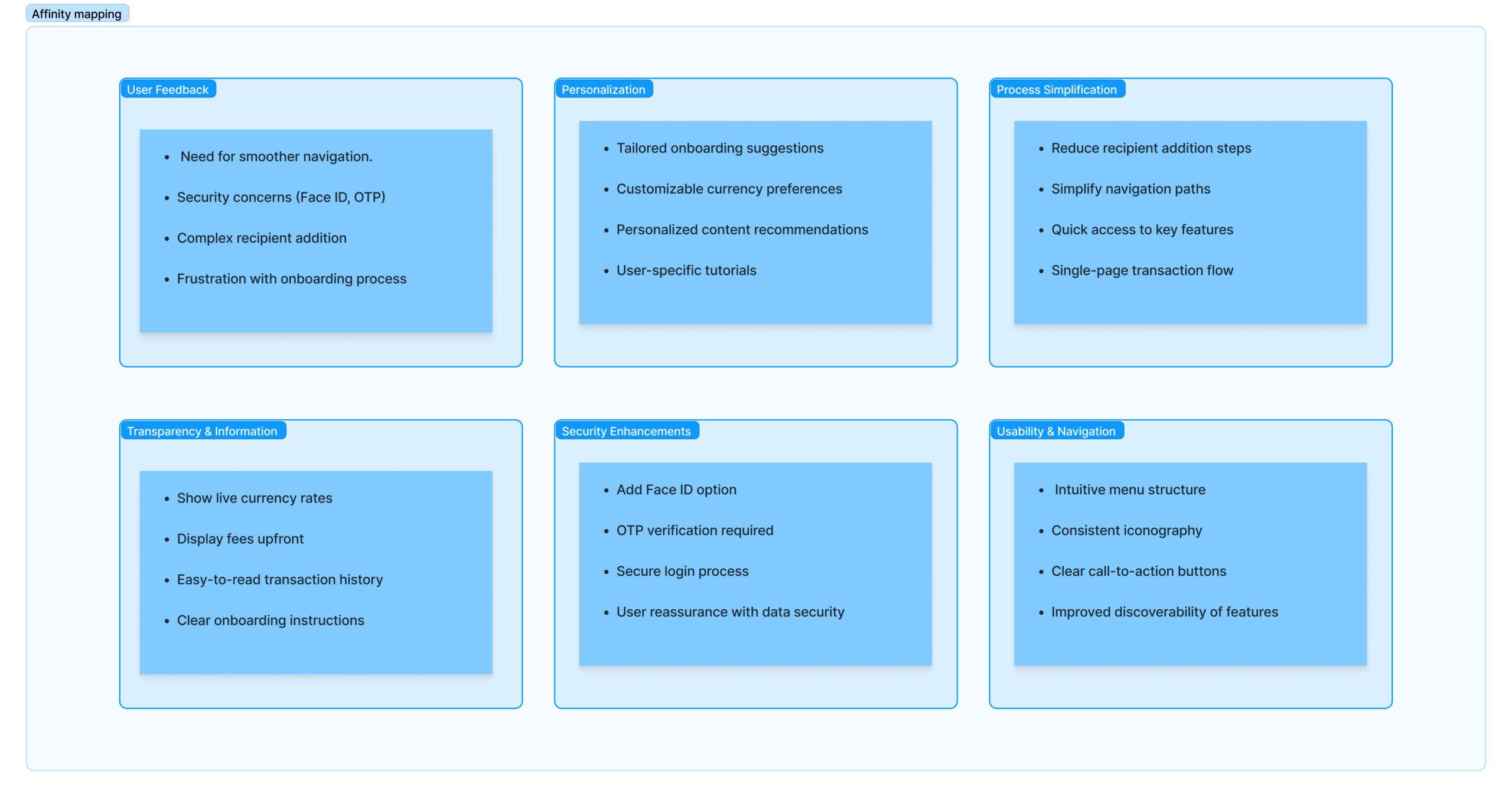
affinity mapping
I categorized the key insights from user research into six distinct streams. This helped in organizing the findings and identifying focus areas for improving the app design.
user persona

ideate
In the brainstorming session, I generated a wide range of ideas to address the problems identified during the research phase, focusing on simplifying recipient addition, enhancing navigation, and creating an engaging onboarding process.
I created eight sketches based on these ideas and sought user feedback on each concept to gauge their effectiveness and gather insights.
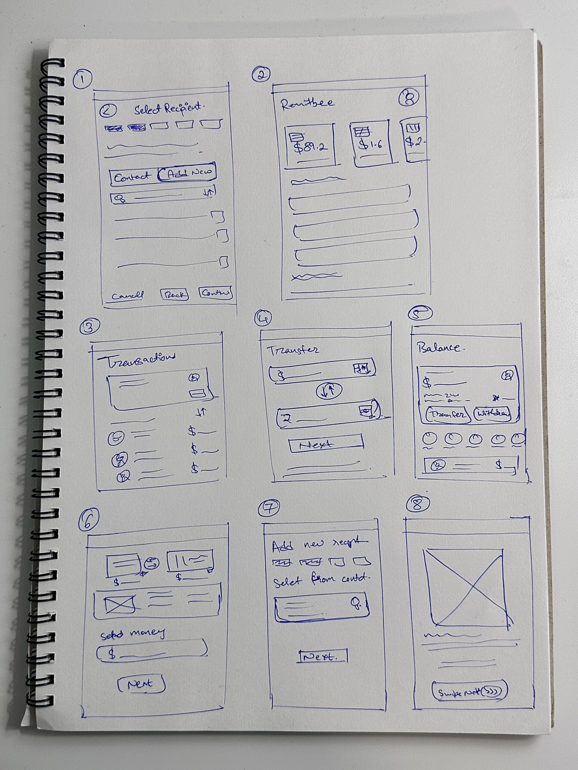
low fidelity designs
I developed low-fidelity wireframes to visualize my ideas and structure the app’s layout. These wireframes served as the foundation for creating detailed high-fidelity designs.

high fidelity designs
For the high-fidelity designs, we incorporated brand-specific fonts and colors to ensure consistency with Remitbee’s established identity while enhancing user experience.
prototype and testing
with user insights as our guide, multiple prototypes were meticulously crafted, each representing an iteration of the new app design. Through user testing, participants interacted with these prototypes, offering invaluable feedback that fueled iterative refinements.

usability testing and feedbacks
- we tested the redesigned single-page recipient addition process and found users found it intuitive and time-saving.
- improved navigation was assessed, and users reported it made it easier to find key features like transaction history.
- the updated onboarding process was evaluated, and users felt it effectively explained app features, leaving them more informed and engaged.
- the implementation of enhanced security features, including Face ID and OTP verification, was tested, with users expressing increased confidence and satisfaction in the app’s security.
user suggestions
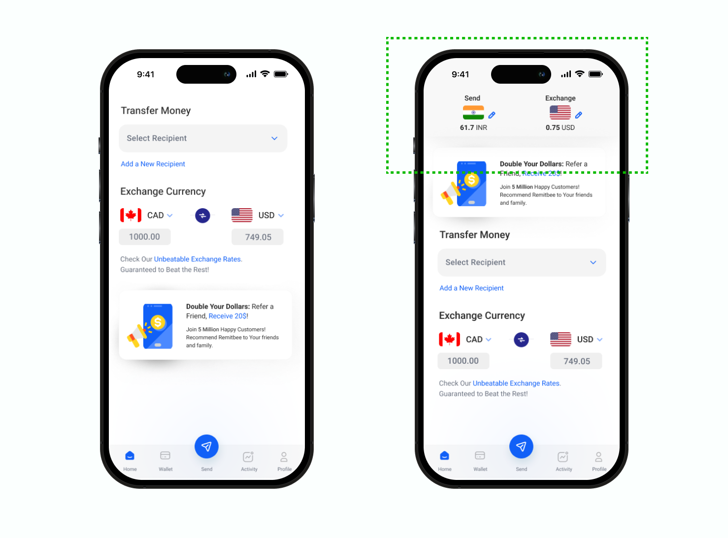
add default currencies on home screen
- feedback: users need to quickly view exchange rates for frequently used currencies without navigating away from the home screen.
- improvement: introduce an option to set and display two default currencies directly on the home screen for easy access and comparison of exchange rates.
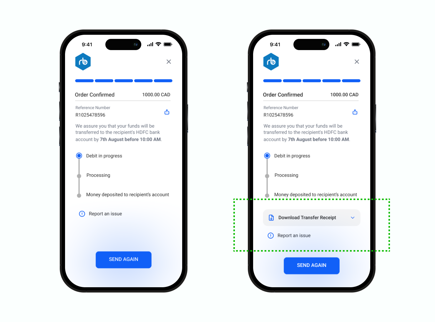
implement downloadable transaction receipts
- feedback: users want the ability to download transaction receipts for their records, similar to features offered by competitors.
- improvement: add an option to download and save transaction receipts after a transaction is completed, providing users with better record-keeping and transparency.
solution
A concise preview presented in the form of a prototype video.
result
the development is still left to start, but by doing user testing and feedback rounds on the final prototype, we got the following results:
- enhanced user experience: users found the navigation to be much clearer and more intuitive, leading to improved satisfaction and ease of use.
- increased efficiency: the new single-page recipient addition process has reduced the time and effort required, making transactions quicker and more straightforward.
- boosted confidence: advanced security features like face id and otp verification have increased users’ trust in the app’s safety and reliability.
- informed decision-making: live currency rates displayed before login have provided users with transparent exchange rate information, aiding in better decision-making for transfer.
what would i do differently?
- more frequent testing: i conducted usability testing at key milestones, but next time i would incorporate more frequent testing throughout the project to identify issues earlier and make timely adjustments.
- enhanced onboarding: while the onboarding process was improved, next time i would focus on creating more personalized onboarding experiences based on user data, such as tailored tutorials and content recommendations based on user behavior.


