
transitpro
/streamlining public transportationImagine navigating the city while juggling multiple apps—one for tracking buses, another for planning routes, managing passes, and buying tickets. It’s a hassle, right? That’s where TransitPro comes in.
Frustrated commuters, including myself, needed a streamlined solution. Managing daily commutes across different apps wastes time and adds stress.
TransitPro simplifies this by consolidating all these features into a single app, allowing you to track your bus or train, plan routes, manage passes, and purchase tickets—all in one place. It’s like having a personal assistant for your commute!
mockups
zoom
research and discovery
The main goal of the research and discovery phase was to understand the current landscape of public transit apps, spot gaps and pain points, and gather insights from real users.
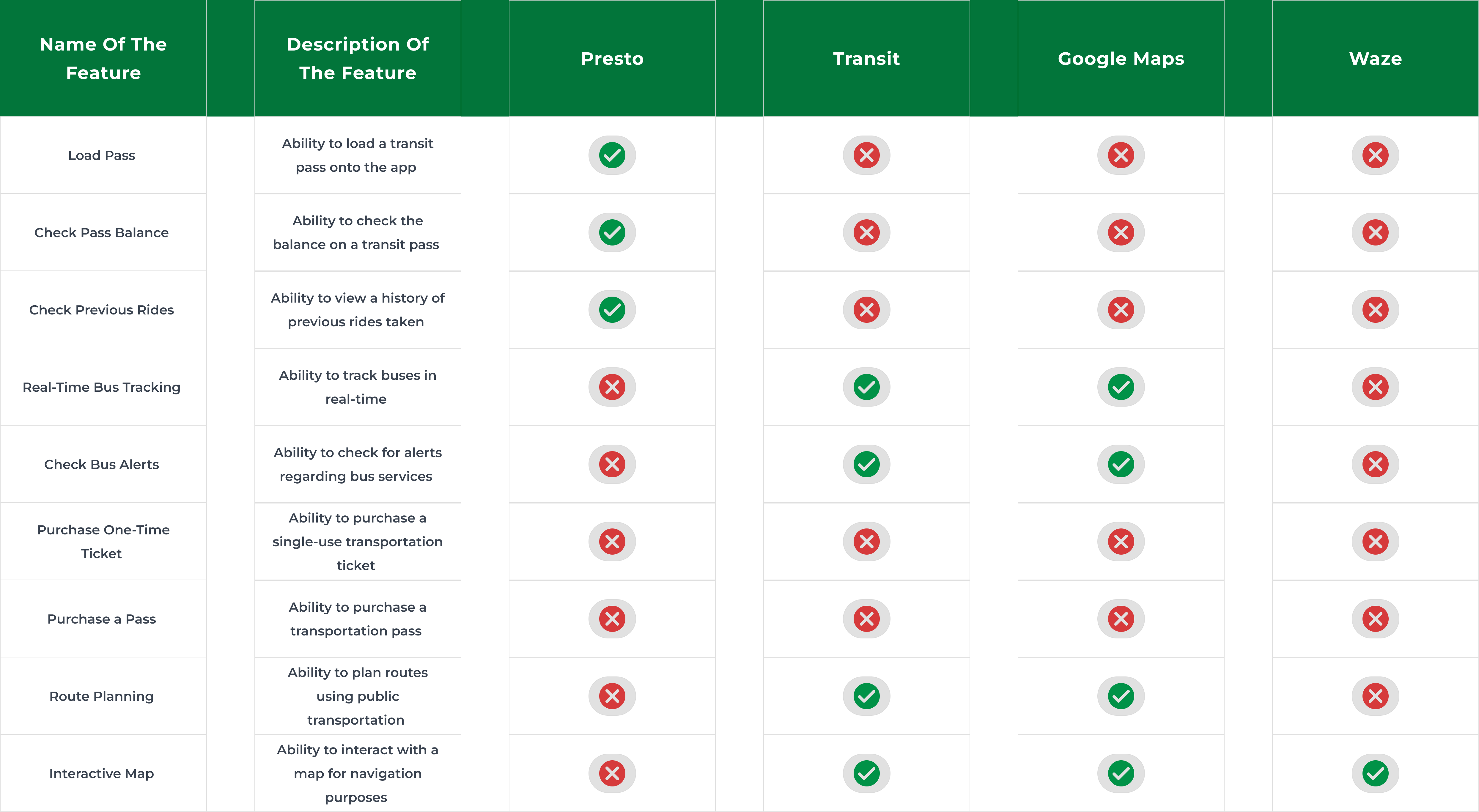
Competitive Analysis
A detailed competitive analysis was conducted on four popular transit apps: Presto, Transit, Google Maps, and Waze.
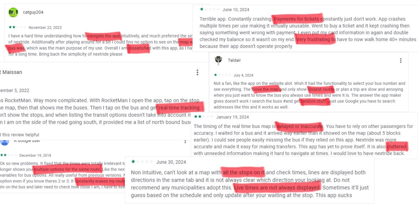
Google Reviews Analysis
I analyzed user reviews on Google Play for existing transit apps. This provided us with real-world insights into the frustrations and pain points experienced by users of these apps. Here are some of the reviews:
key findings
The key findings from our research were:
- Presto offers pass management but lacks features for real-time bus tracking, route planning, and ticket purchasing.
- Transit provides real-time bus tracking and alerts but does not include pass management or ticket purchasing capabilities.
- Google Maps excels at route planning and real-time tracking but does not have integrated pass management or ticket purchasing functions.
- Waze features an interactive map but does not offer real-time bus tracking or pass management.
design process
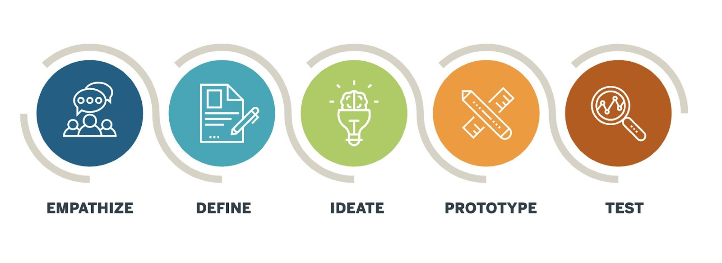
Design Thinking methodology was utilized in the TransitPro to ensure a user-centered approach that addresses commuters’ needs and frustrations.
empathize
During the Empathize phase, a survey was conducted with 17 responses highlighting the following pain points:
- Frustration with using multiple apps for tracking, planning, and pass management.
- Inconsistent real-time tracking, causing missed buses.
- Difficulties managing passes and purchasing tickets.
- Lack of timely alerts about route changes or delays.
User Persona:
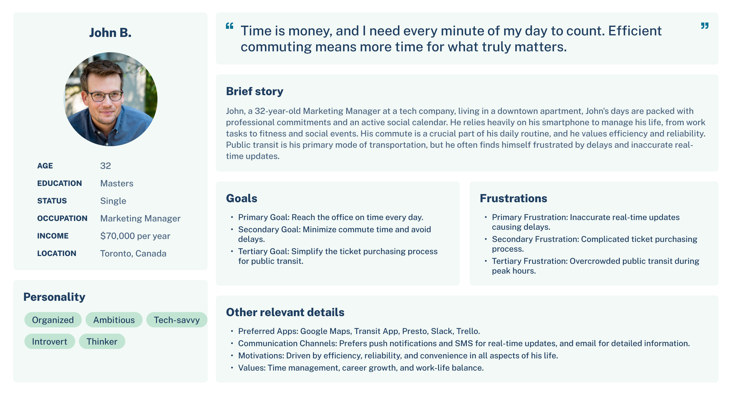
User Experience Mapping
We mapped out John’s journey to understand his interactions with transit apps throughout his commute. This included:
- Planning the Trip
- Waiting for the Bus
- During the Ride
- Post-Ride
ideate
In the ideation phase, I shifted to brainstorming solutions for key user issues, refining the best ideas to create TransitPro.
I generated three design concepts and gathered feedback from friends, colleagues, and three strangers on a bus, focusing on their likes and dislikes.
Concept A: Card Management and Home Screen
- Features: Card reloading, ticket purchase, autoload, balance check.
- Feedback: Users liked showing map, card, and balance together.
- Suggestion: Add real-time tracking on the home screen.
Concept B: Real-Time Tracking and Routes
- Features: Bus routes and real-time tracking.
- Feedback: Users found the map-only home screen cluttered and missing key information.
Concept C: Real-Time Bus Alerts
- Features: Real-time bus alerts with color codes for stopped, soon-to-be-stopped, and resumed services.
- Feedback: Users wanted Presto balance and recent trips on the home screen.
Final Choice
Based on the feedback, the best elements from all three concepts were combined. Concept A’s home screen with a map, Presto card, and balance; Concept B’s real-time bus tracking; and Concept C’s color-coded alerts.
prototype
Wireframes
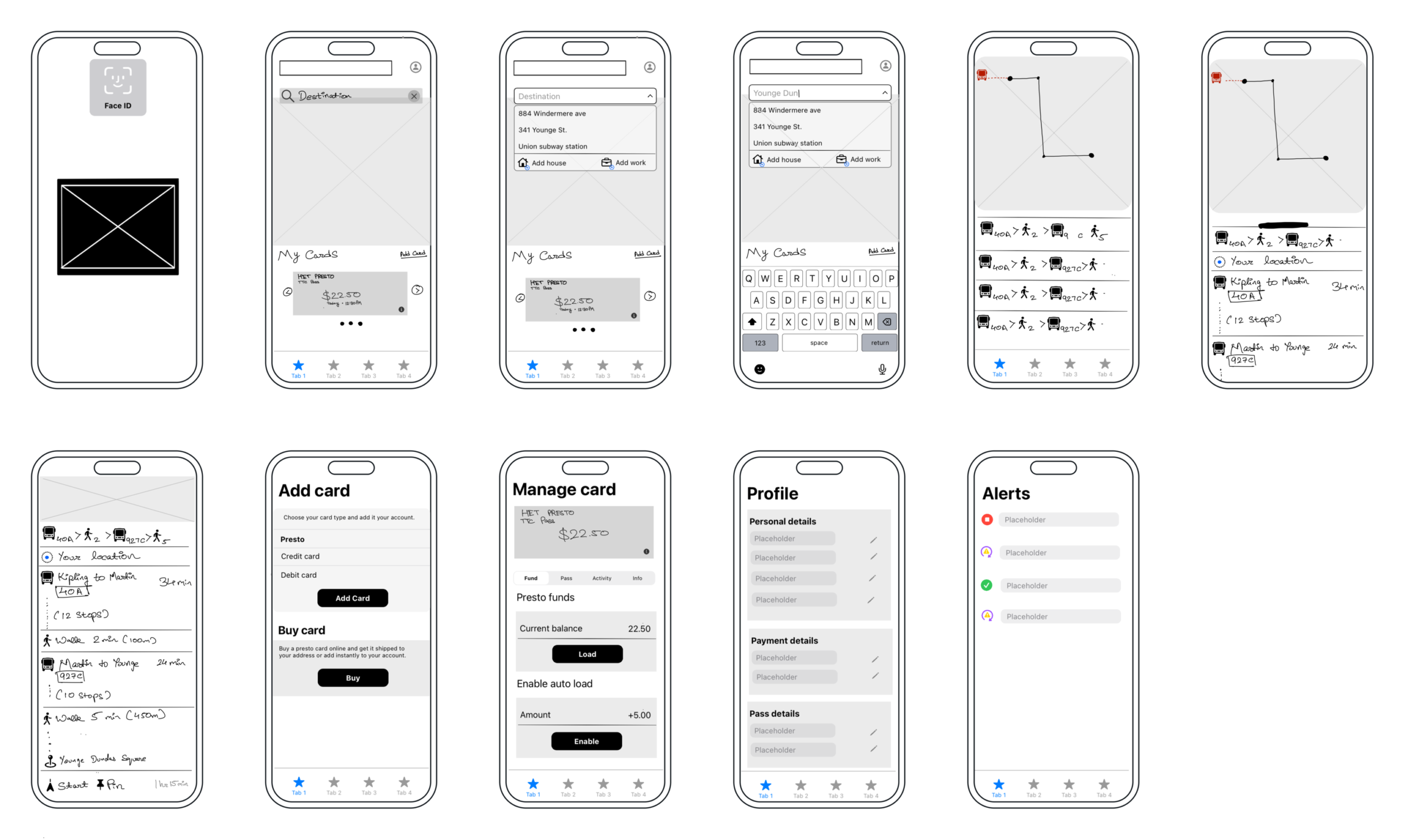
Design System
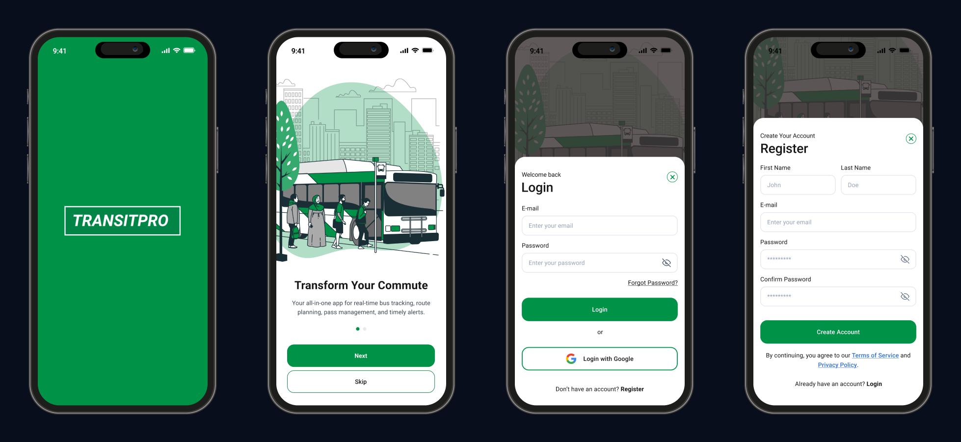
Onboarding and login screens
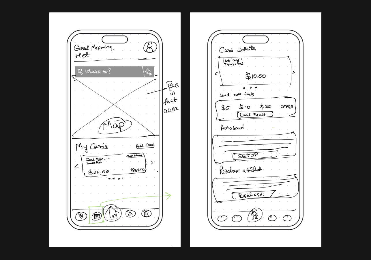
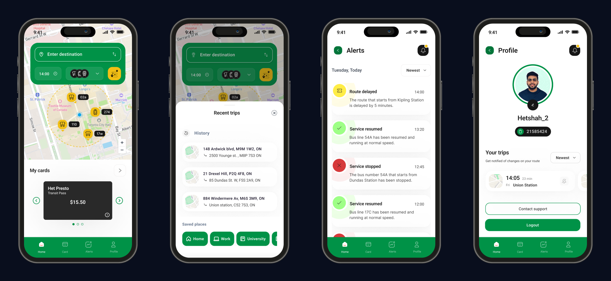
Home and profile screens
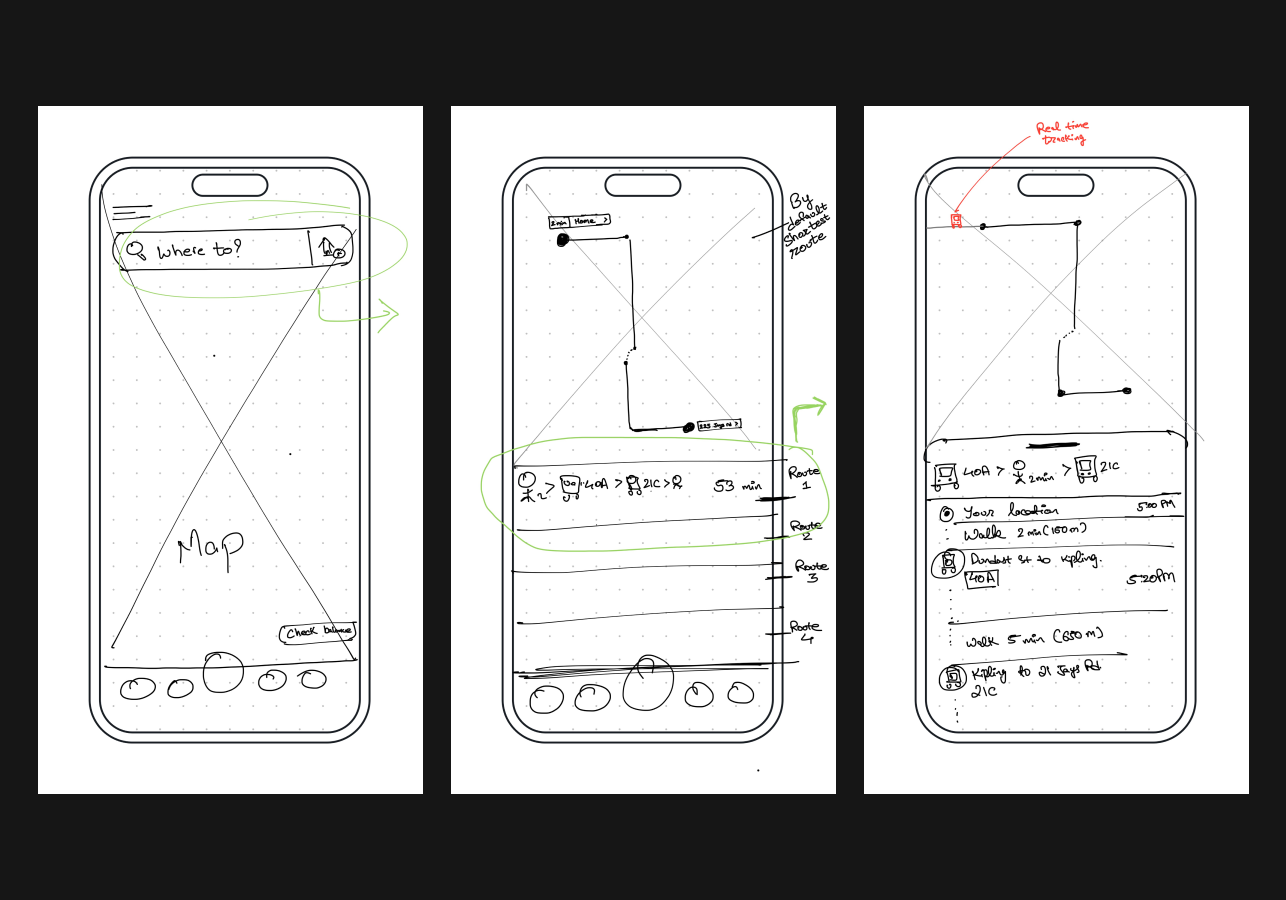
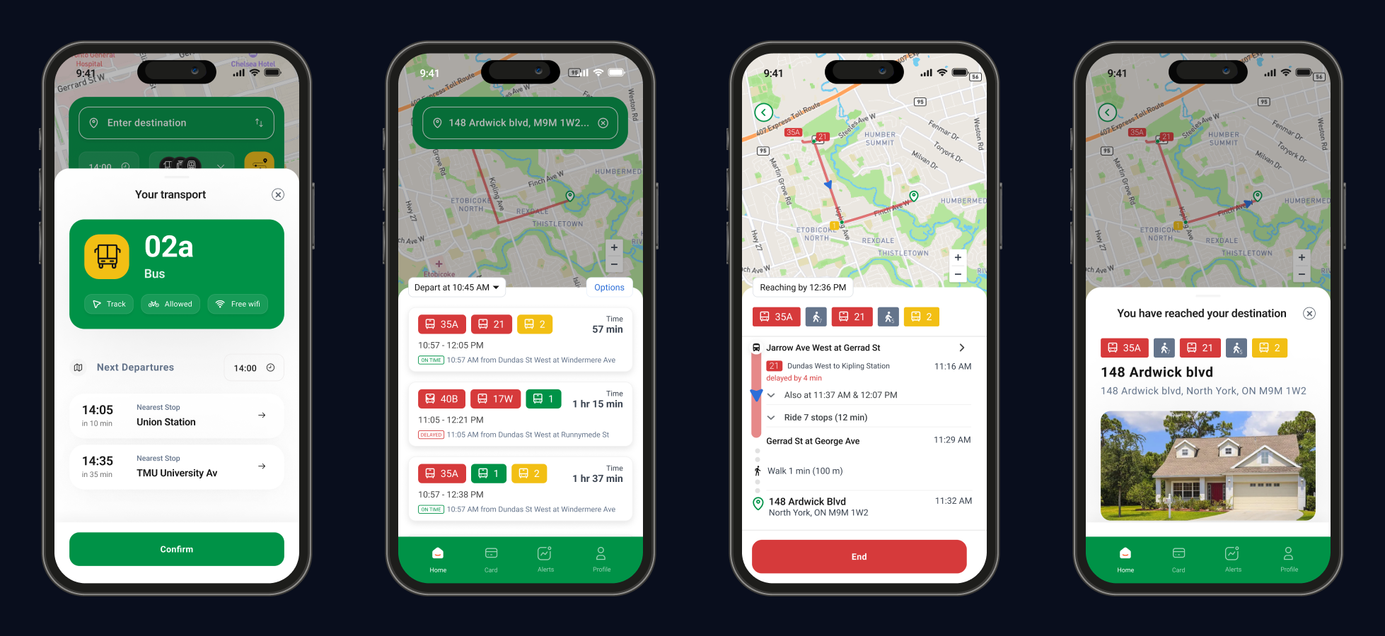
Trip screens
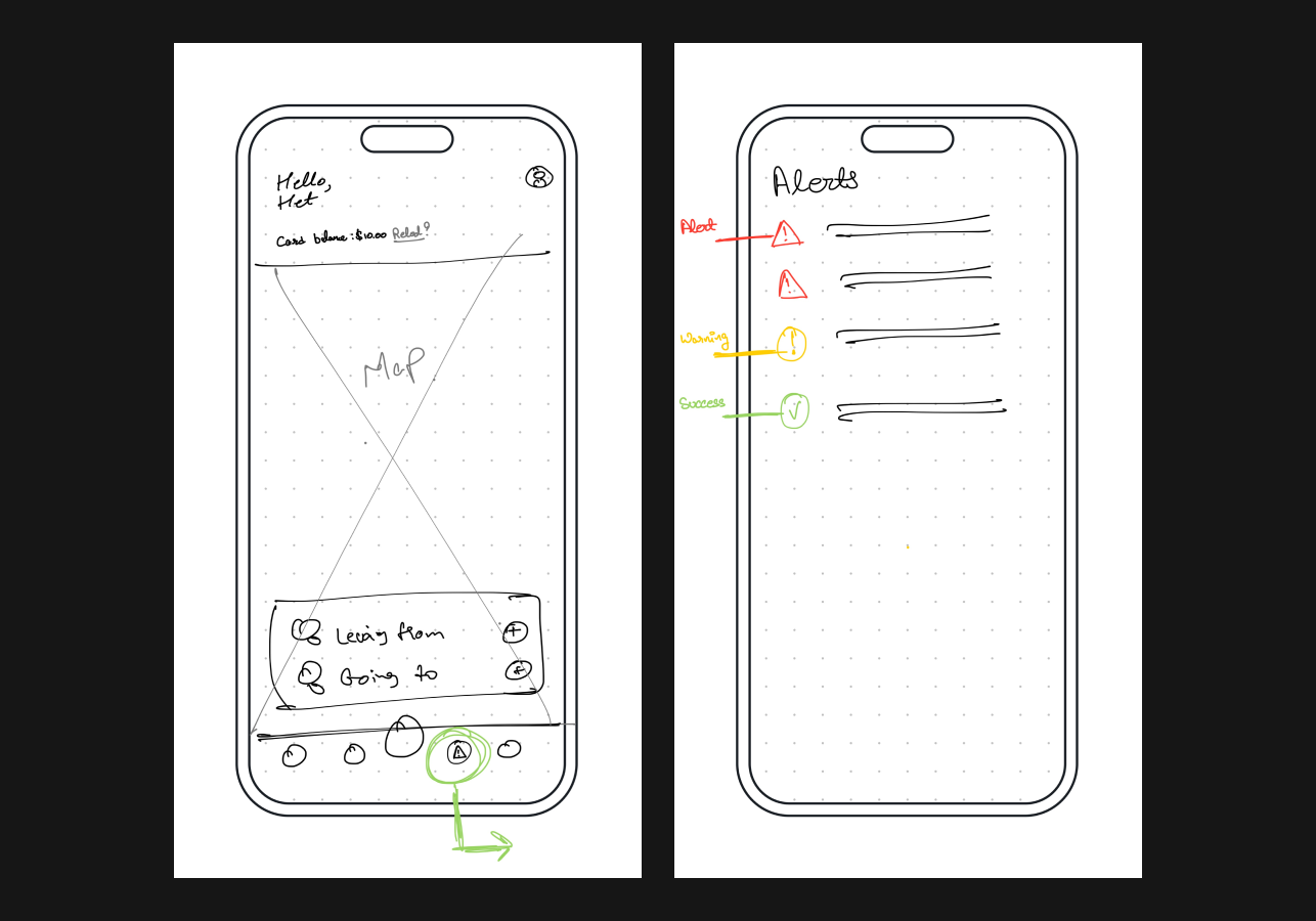
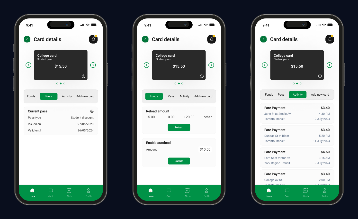
Other Screens:
result
Here’s how the app is being improved for everyone:
- User-Centric Design: Combines key features for a seamless, commuter-focused experience.
- Enhanced Usability: Real-time tracking, balance management, and alerts in one easy-to-use interface.
- Efficient Commute: Centralized information helps users plan better, saving time and reducing stress.
what would i do differently?
Looking back, a few improvements could enhance future iterations of the project:
Diverse User Testing: Expanding testing to include a broader range of users would offer deeper insights into user needs.
Iterative Design: Adopting a more iterative approach with multiple feedback rounds could help refine the product earlier.
Accessibility Focus: Prioritizing accessibility from the start would ensure the app is usable for everyone, including people with disabilities.


